Grids and Spacing
Qohash's spacing and grid systems to ensure visual consistency across all Qohash marketing designs
Spacing System
Our spacing scale provides consistent measurements across all Qohash products.
Use these predefined values to maintain visual harmony and proper information hierarchy.
2XS
2px / 0.125rem
Border widths, hairlines, and minimal visual separators
XS
4px / 0.25rem
Tight spacing between closely related items, icon padding
S
8px / 0.5rem
Default padding for buttons, spacing between related elements
M
12px / 0.75rem
Standard component internal padding
L
16px / 1rem
Padding between major interface elements, card padding
XL
24px / 1.5rem
Section padding, spacing between unrelated elements
2XL
32px / 2rem
Margins between components, content block spacing
3XL
36px / 2.25rem
Padding for modal dialogs, larger content blocks
4XL
40px / 2.5rem
Section margins, spacing between major UI segments
5XL
48px / 3rem
Large section padding, hero section spacing
6XL
64px / 4rem
Page section dividers, major content block separation
7XL
72px / 4.5rem
Large hero sections, major layout divisions
8XL
80px / 5rem
Maximum component spacing, large layout gaps
9XL
88px / 5.5rem
Extensive vertical rhythm, major page sections
10XL
96px / 6rem
Maximum section padding, full-page component spacing
11XL
104px / 6.5rem
Large-scale layout spacing, major page divisions
12XL
112px / 7rem
Maximum layout spacing, dramatic visual separation
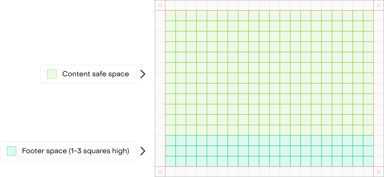
Qohash 4x grid system
Two pagers
Grid system (36px / 0.5" cubes)
Condensed cover (Portrait)
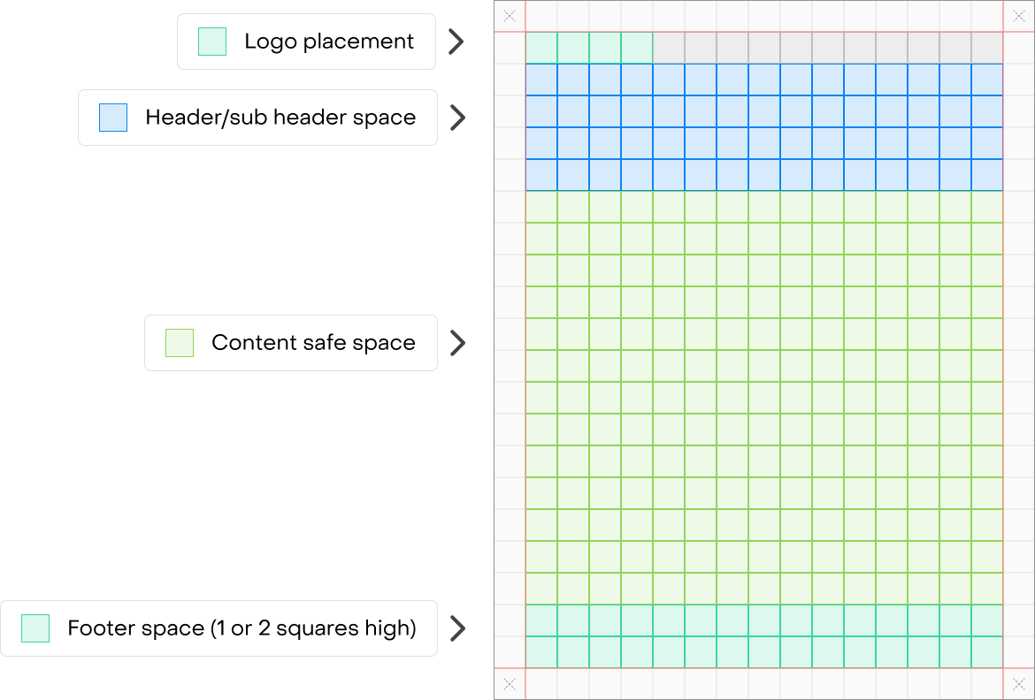
Body page / End page (Portrait)
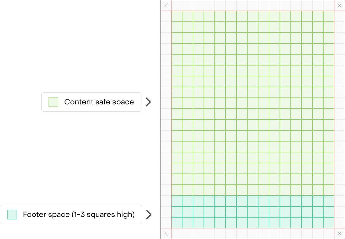
Condensed cover (Landscape)
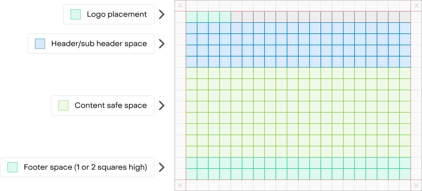
Body page / End page (Landscape)